

Whom
Founded in 1900 and headquartered in Zierikzee, the Netherlands, Zeelandia has grown into a global player in the bakery industry, supplying ingredients to bakeries, pastry shops, and confectioneries. Today, more than 3,000 employees worldwide are dedicated to developing products tailored to local needs and preferences, with operations in over 30 countries and sales in approximately 100 countries.
Zeelandia established its presence in Romania in 1998, following the acquisition of the Polish Superbake Group, including its Romanian subsidiary.
What
Logo Redesign, Visual Identity, Packaging, Website, Print Design
When
2019
Website
Brief
Rotunda Românească is a bread brand launched in the summer of 2011, and the first Romanian bread brand to be built around a clearly defined concept, including dedicated packaging, a website, and a strong brand message: “Out of love for bread, out of respect for you.” The concept was built around three core values: health, tradition, and Romanian heritage.
Rotunda Românească was the first packaged bread brand in Romania to establish a distinctive visual identity of its own.
The brand was ready for a rebranding, with a modern design aimed at highlighting its health-related benefits and claims. The product needed a new visual identity that would stand out on the shelf, be easily recognisable, and appeal to a wider range of consumers. The information presented on the packaging also needed to be clear and easy to understand, communicate effectively with consumers, and align with their values and expectations.
The Rotunda Românească brand communicates the following:
- Clean-label ingredients – no E-numbers, artificial colours, or flavour enhancers
- Nutritional value from vitamins, minerals, and fibre, depending on the variety
- A rich, enjoyable taste, achieved through the use of different types of flour and seeds
- 100% Romanian product
- Made with natural sourdough starter
Challenge
Rotunda Românească comprises five bread varieties: Rustic White, White with Potato, Rye, Fibre, and Multigrain. Each variety is available in a 500 g sliced loaf, with a shelf life of five days.
The existing colour palette was retained, with minor adjustments to the shades.
Keywords: fresh, bold, traditional, clean
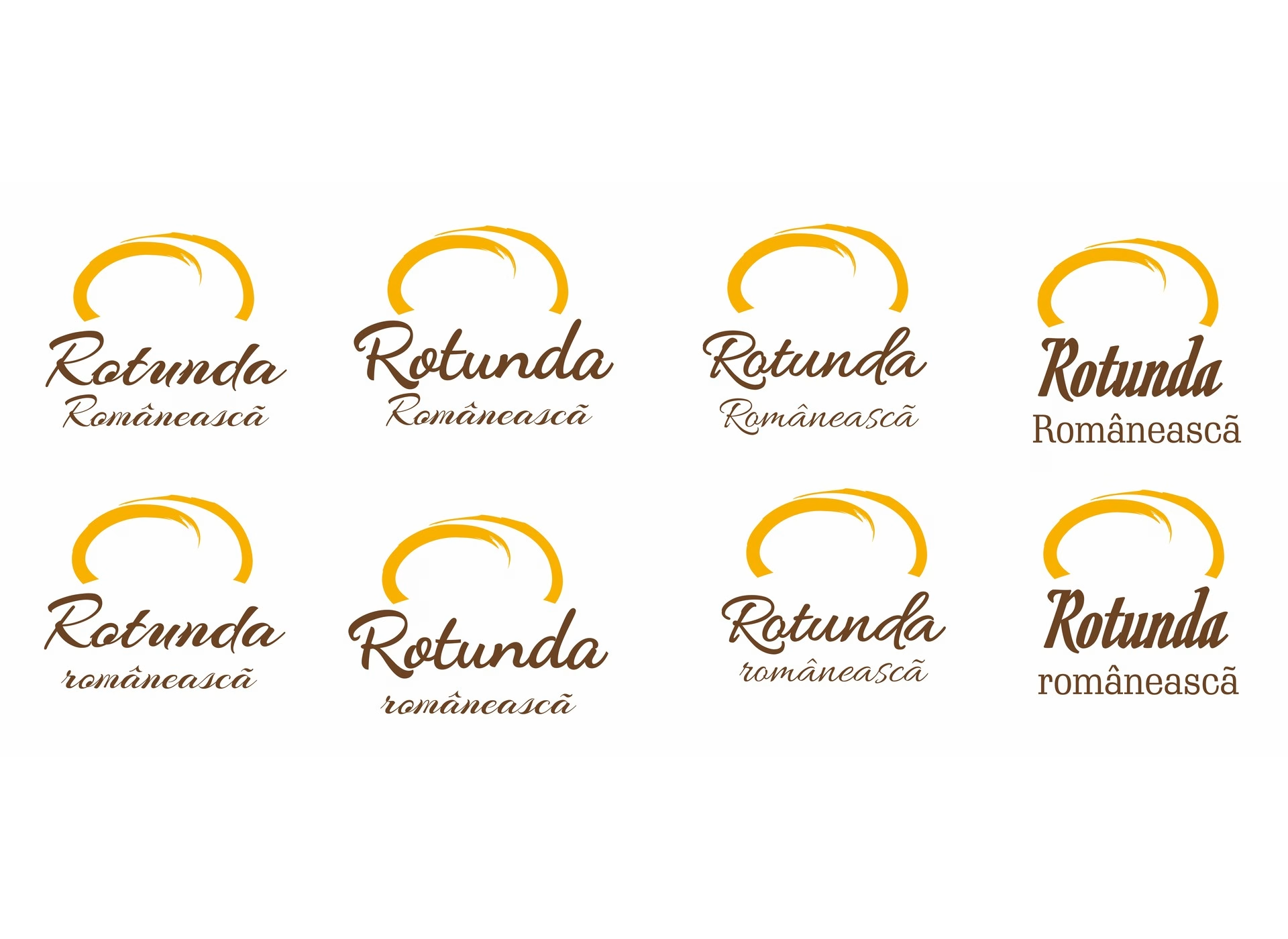
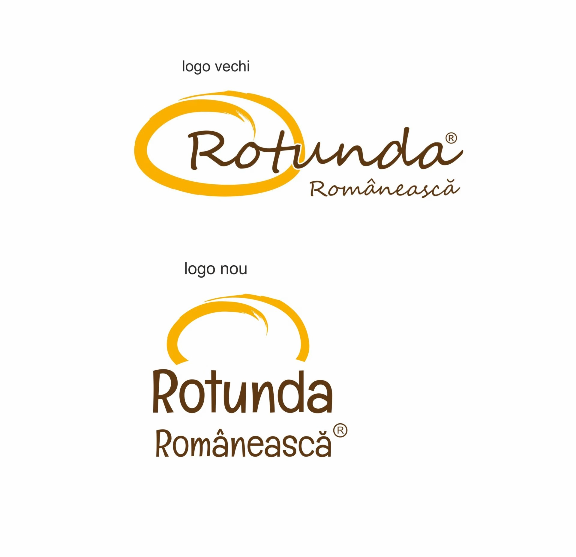
The client requested a refinement of the logo, preserving the original concept while communicating the traditional character of the brand more effectively.
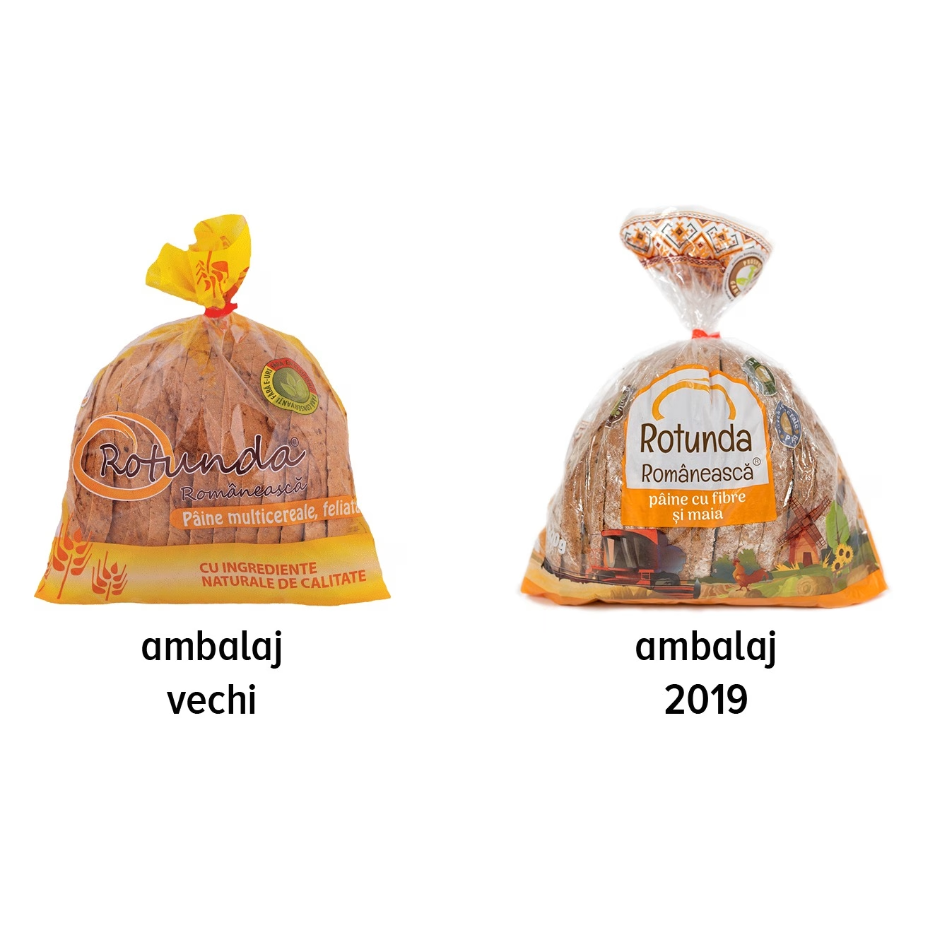
The Rotunda Românească packaging was completely redesigned, introducing a modern and visually bold approach tailored to the target consumer.
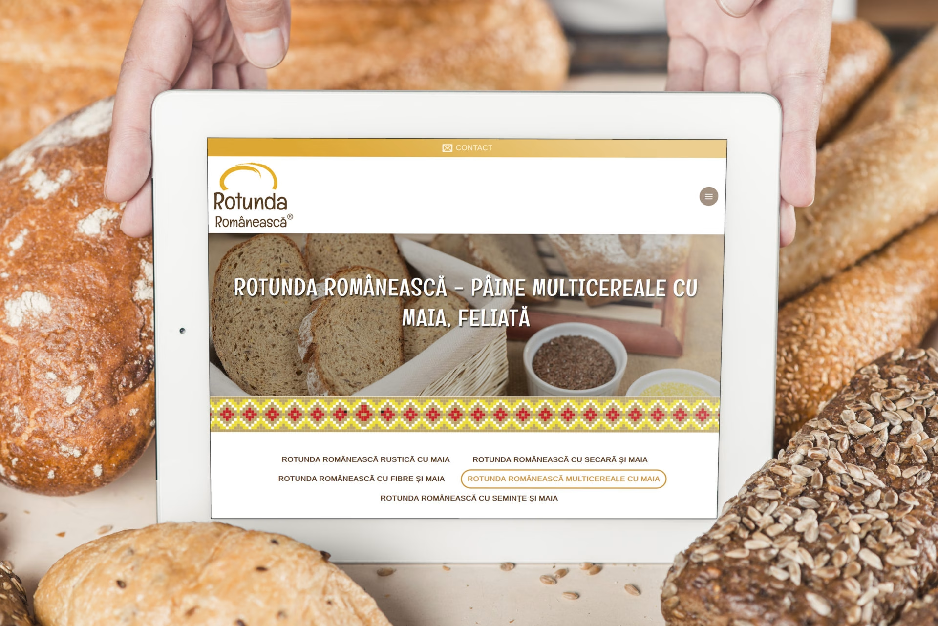
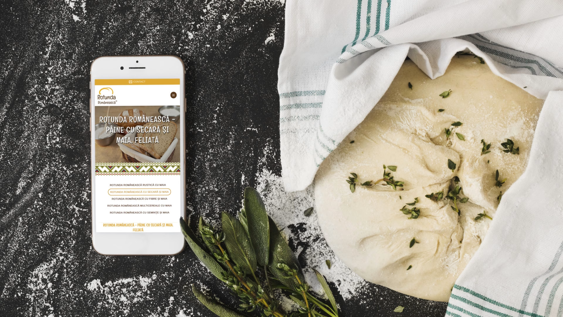
The website was designed in line with the new visual identity and includes the following pages: About Us, Our Products, Blog, Careers, and Contact. Content is managed through a CMS, allowing text and images to be easily updated.
Execution
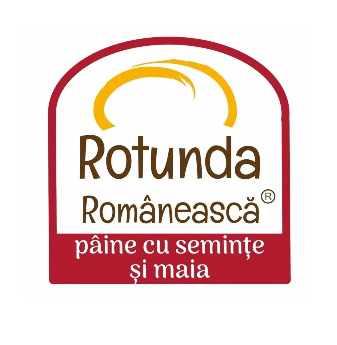
For the new logo design, we removed the text overlay from the symbol, arriving at a simpler and clearer vertical composition. The outline framing the logotype on the packaging takes the shape of a traditional bread oven, with the overall composition reinforcing the brand’s traditional character. Several typeface options were explored, ranging from archaic to robust and solid, supporting the idea of heritage and tradition without suggesting a handmade or artisanal product.
The original colours were retained, as they naturally evoke associations with earth, grains, and sunlight.
The new Rotunda Românească packaging was designed by the CRYO team to present the product as a modern choice for active, energetic people who value their own health and that of their families.
Compared to the previous packaging, the new design introduces a more vibrant colour palette for several reasons:
- The packaging stands out clearly from competitors such as Panifcom, Vel Pitar, and Afer, which predominantly use linear colour schemes based on red, yellow, and brown.
- The brighter colours convey energy and positivity — qualities that a staple product in the Romanian diet should embody. Consumers are naturally more drawn to products with cheerful, vibrant packaging than to those with a dull or understated appearance.
Given that the product follows a traditional recipe made with natural sourdough starter, we incorporated a traditional Romanian folk motif into the packaging, website, and promotional materials, while keeping the visual language refined and sophisticated rather than folkloric or overly traditional.
Rotunda Românească is a product that takes the best of traditional breadmaking from 150 years ago and beyond – namely, the recipe – and brings it into the modern era. It is produced using modern methods and strict quality control, while preserving the authentic flavour and character of a truly traditional bread.
This principle guided CRYO web & advertising in defining the elements that would become an integral part of the brand identity: the combine harvester, the mill, the fields, and the rooster. Modern and traditional elements are brought together while preserving the timeless, rural atmosphere of country life – a place where food is pure, wholesome, and closer to its natural origins.
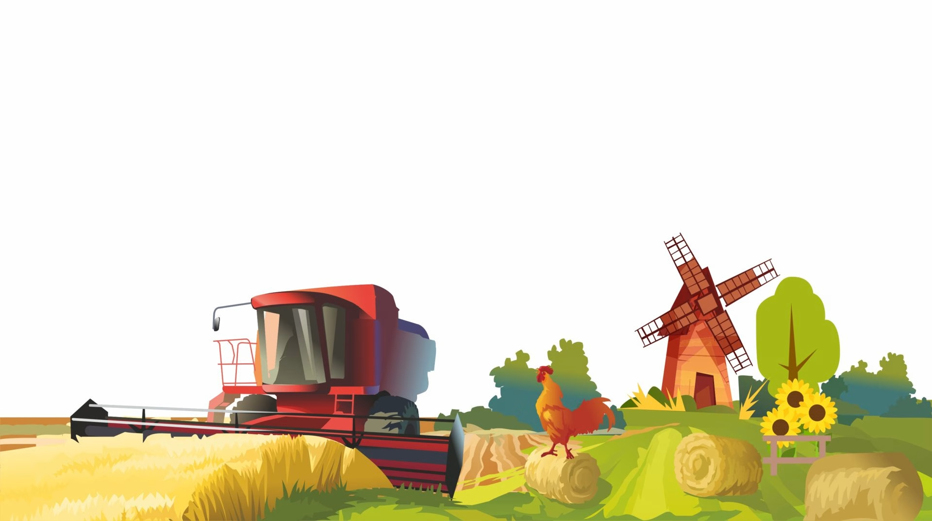
The rooster is what brings the landscape to life, as we deliberately removed the human element – avoiding any association with other Zeelandia products or with the ubiquitous baker commonly featured on bread packaging across the market. There is also a natural and subtle connection: a healthy, well-fed rooster thrives on quality grain, making its presence both relevant and meaningful.
The combine harvester represents state-of-the-art technology, conveying modernity and quality through advanced production methods. Rotunda Românească is not a product made using modest or outdated means, but a high-quality product manufactured under advanced technical conditions by a premium company. This is why the combine harvester fits naturally alongside the other elements of the landscape.
Execution
The website features a clean and intuitive user experience, with a fully customised design incorporating elements from the new visual identity and packaging design, as well as the colour palette defined in the brand guidelines. The footer brings together the design elements described above. National motifs are also incorporated into the presentation page for each individual product.
Below are some of the key features of the new website, rotundaromaneasca.ro, developed by CRYO web & advertising:
- Modern redesign and enhanced functionality
- Custom web design tailored to the client’s requirements
- Modern technologies: HTML5, JavaScript, CSS3, PHP 7, MySQL
- Responsive design and mobile optimisation
- Website administration backend with unlimited page and article editing/creation, as well as media upload functionality
- Contact form protected by Google’s invisible reCAPTCHA
- Integrated blog
- Social sharing buttons for articles
- Integrated Facebook plugin
- GDPR compliance and privacy policy page